
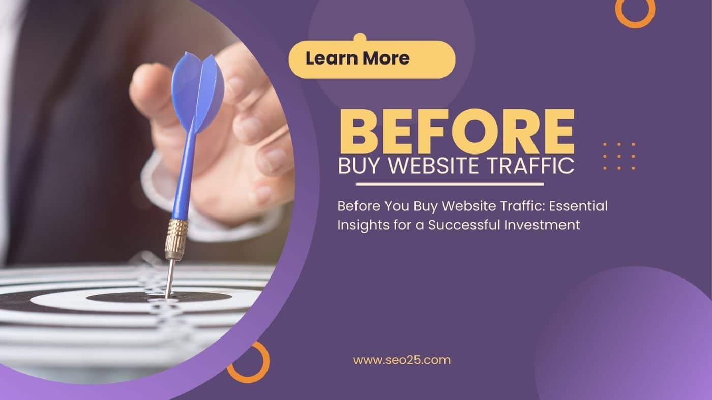
Landing Page Mastery: 13 Types and 14 Optimization Tips
A Landing Page, or simply a landing page, is a standalone web page specifically designed to achieve a digital marketing strategy. It is created in collaboration with web design experts and digital marketers to pursue specific goals, such as gathering contact information, increasing site traffic, and driving sales. Unlike general website pages, a landing page focuses on a single objective, known as a Call to Action (CTA). In this comprehensive article, we review 13 different types of landing pages and introduce 14 practical, expert solutions for landing page optimization to help you maximize your conversion rates.
What is a Landing Page?
A landing page is a dedicated destination where a visitor “lands” after clicking a link from an email, an ad, or another digital source. Its primary purpose is to capture the visitor’s information through a lead form. Marketers can store this contact information using forms where visitors enter details such as their name, address, email, and job title. This allows you to build a database of leads for future marketing campaigns.
Whether you are looking to buy targeted website traffic or run organic campaigns, sending that traffic to a specialized landing page significantly increases your chances of conversion compared to a generic homepage.
13 Types of Landing Pages Every Marketer Should Know
Different goals require different landing page structures. Below are 13 distinct types of landing pages used by top marketers to achieve specific business outcomes.
- 1. Squeeze Page (Lead Capture)
According to statistics, 79% of B2B marketers say that email is the most effective channel for generating demand. Therefore, it is not surprising that squeeze pages are among the most important and effective landing pages.
A squeeze page (also known as a lead capture page) has a singular goal: to extract the user’s email address. Once you have the email address of your visitor, you can execute your marketing work with relevant content and subsequent offers. The most common type of squeeze page offers “real-time value” in exchange for an email address. This includes newsletters, e-books, whitepapers, and other gated content.
To succeed with a squeeze page, make sure your offer is simple, tempting, and valuable enough to motivate the user to enter their email address. Avoid clutter; focus entirely on the value proposition.
- 2. Splash Page
The Splash page is a unique type of landing page that does not always target data storage. These pages are usually used as a preliminary “door” when a visitor clicks on a social media or a content link. Instead of sending them directly to the article, they land on this splash page.
These pages often serve as an age gate, a language selection page, or an announcement screen. For example, it might share a notification like “We have just unveiled the date of our 2024 Marketing Conference.” It might also ask the user to select their preferred language or age. The splash page may even display an ad for the publisher to benefit from.
A splash page serves two specific functions: First, it acts as a gateway, allowing the user to easily click through to the content. Second, it captures the user’s attention with a specific, high-impact message or offer before they proceed.
- 3. Lead Capture Page
A lead capture page is similar to a squeeze page but generally requests more detailed information. While a squeeze page might only ask for an email, a lead capture page may ask for the business name, full email address, job title, industry, and company size.
The information you request from the visitor depends on your sales goals and the customer’s position in the sales funnel. If your lead capture form is at the top of the funnel, it is best not to use long, complex forms that might scare away potential leads. However, if your customer arrives after showing genuine interest (e.g., after viewing a pricing demo), you can ask for more detailed information to help your sales team guide them effectively.
- 4. Click-Through Landing Page
All expert marketers know that they must offer value to the customer before asking for money. A click-through landing page serves as a “middleman” that builds the case for your product. It explains the value proposition without being tangible to the customer before they click the “Buy Now” button.
Often, this page looks like a sales letter. It outlines the benefits and features of your product and encourages the customer to try it or answer key questions. When they click the button, they are directed to a transaction page (like a shopping cart) that provides pricing details and requires payment information. When your customer lands on a click-through page, they feel informed and confident about how to move forward to the final destination.
- 5. Get Started Option
This option, typically seen in Software as a Service (SaaS) models, features a “Get Started” button prominently at the top of the page. You can see a great example of this on Mailchimp.
This button explains the main benefits succinctly. The user is at a crucial decision stage. A clear, accessible “Get Started” button is waiting for the audience, often leading directly to a registration form. It simplifies the journey from interest to trial or sign-up.
- 6. Unsubscribe Page
Obviously, you do not want to lose subscribers, but you should consider this type of landing page carefully. It is essential for compliance and user experience. Ensure that users can successfully unsubscribe and are given the opportunity to adjust their preferences or settings rather than a complete opt-out.
After all, just because they do not want to receive your emails does not mean they may not want to browse your site. Consider creating a “second chance” option to allow users to re-subscribe to a specific newsletter type if they wish. This maintains a positive brand relationship.
- 7. Long-Form Sales Page
In a long-form sales page, short and concise questions won’t help you close the deal. You need to think about any objections the customer may have. For example, if a customer has a question about the best place to buy website traffic, your landing page must provide clear details on how to buy traffic and how it works.
You must address any obstacles that may arise before purchase and highlight all the benefits the customer will enjoy as they scroll down the page. This format relies heavily on storytelling, testimonials, and detailed feature breakdowns to convert high-ticket items.
- 8. Paid Advertising Landing Page
If you do not have a dedicated landing page for your paid ads (Google Ads, Facebook Ads), you will lose a lot of profit. These pages must be highly relevant to the ad copy. In general, you want to ensure the message match is perfect to improve your Quality Score and conversion rate.
Unlike general pages, these pages are built specifically to handle the traffic from a specific campaign. If you are driving real social media traffic or paid search traffic, the landing page must reflect the promise made in the ad.
- 9. Page 404
404 error pages never look good, but it’s important to optimize them to look their best. Try to be creative with 404s. For example, you can use humor to make up for the mistake and always direct your audience to the main page or a neutral landing page.
You can set your 404-landing page to work as a retention tool. For an example, look at the HubSpot 404 page. They offer the user three options: Visit the blog, learn more about the software, or sign up for a free demo. This recovers lost traffic.
- 10. About Us Page
The “About Us” page does not have to be a dead end. You can turn this landing page into a conversion powerhouse.
Consider an example from Glossier Cosmetics. They blend their About Us page with different history, perspectives, and missions, but still teach the reader how to move forward. At the bottom of the page, they provide a reminder and link to purchase, track orders, email, or subscribe to the company. It’s an excellent way to leverage brand trust.
- 11. Coming Soon
If you want to launch an exciting new product soon but are not ready to reveal the full details yet, you can set up a simple landing page called “Coming Soon.”
You can suggest to your audience that if they wish to receive the launch date of the new product, they should leave their email. This allows you to build a list of interested prospects before the product even exists. It creates buzz and anticipation.
- 12. Pricing Page
If you are unveiling new prices and new product details, you may want to create a dedicated landing page for these changes. Regardless of that, your pricing page should be one of the best-optimized pages on your site.
Here we can take the example of the Wistia pricing page, which clearly shows 3 packages of their products. They highlight the most popular plan visually. Adjust your pricing page so that even if the customer does not talk to a sales representative, they can explore the page in an adventurous way and make a decision.
- 13. Thank You Page
Often, a “Thank You” page does not follow the actual purchase order directly. This page actually confirms an action, like downloading a file. For example, content like this appears: “You have now downloaded one of the best white papers in the world.”
Your thank you page should be accompanied by an additional suggestion or a goal to further engage the user. You are given an incredible opportunity to offer more value—do not waste it.
HubSpot does this expertly. Their thank you page offers an additional suggestion for free advice on applying user-generated content. This keeps the momentum going and moves the lead further down the funnel.
14 Great Tips for Optimizing Your Landing Page
If you want to improve the conversion rate of your website, it is better to optimize your landing page using the best methods and strong data. This process starts from the moment you start designing the page and continues for a long time after the page is created.
Think of building these pages as a product. You do not design the perfect prototype on the first day. Instead, you may create 100 prototypes before you complete the product. Landing pages do not work just like that. You need to create these pages in a way that engages your audience, compels them to act, and meets their expectations.
- 1. Make your proposal clear
“Good marketing makes a company look smart, but great marketing makes the customer feel smart,” says Joe Chernow, a marketing expert. If you want to increase your conversion rate, it is better to use this wisdom when building your landing page.
When you first start planning your optimization strategy, think about how you can lead the customer to experience positive emotions. You want them to feel smart, grateful, inspired, and excited. Start by thinking about your customer’s specific goal and turn that goal into a powerful headline. Avoid jargon and speak directly to their needs.
- 2. Simplify your landing page
A very simple landing page may seem vulnerable, but it avoids the complexity and confusion of the audience. If you want your audience to focus on the reward, call them to action with clear, concise language.
Dropbox is consistently one of my favorite examples. This landing company creates very attractive pages that have a large volume without high use of efficiency words. There are only 5 main elements at the top of the page. The fourth provides a pleasant but subtle image, and the last element is the focus on the Call To Action. Simplicity drives clarity.
- 3. Try contrasting colors
The best landing pages I have ever seen use a lot of color contrast but are excellent in terms of color harmony and sharpness.
In the Starbucks example, you cannot ignore the CTA. Even though the “Join now” button reflects the color of the star in the logo on the left, it is much more prominent and clearer. The use of negative space between the logo and other elements guides the eye. Use contrasting colors to make your primary CTA pop.
- 4. Hold the important parts “Above the Fold”
The term “above the fold” refers to a newspaper. In traditional newspapers, the most compelling stories were always placed on the front page at the top so that customers could see the headlines and want to buy the newspaper.
You can do the same by holding the elements of your landing page at the top of the digital screen. That is the point where the user has to move (scroll) for more information. Now that most people are using smartphones and tablets, this is a little more difficult than ever. The good news is that you can use a scroll map to easily pinpoint the average location of the fold on other devices.
- 5. Use scarcity techniques
Time constraints and quantity constraints are common marketing terms. The lack of landing page visitors forces you to do this and use these phrases because they know that if they procrastinate too much, they will lose the opportunity.
Even department stores use this method. Seeing phrases like “only 2 minutes left” makes the user want to order immediately and be able to use or buy the product before anyone else.
You can do this on your website and attract an audience by activating a limited time for a discount or offering a specific time to use a webinar that may never happen again. A countdown timer can add a visual element to the constraint. This tells your visitors how long they can take action on the offer.
- 6. Place your call buttons directly
A call button or CTA should not cause the reader stress and confusion. Make your proposal clear, concise, and unambiguous. In the photos we shared above, you will see that companies avoid fantasy language and complicated offers and use phrases such as:
- Click to download
- Try the free trial
- Connect now
- Select here
These phrases are very simple but effective. Place the button where the user expects it to be—immediately visible and clickable.
- 7. Add contact information
You can make your website contact information available to your website visitors in different ways. You can put your contact number or email address on the landing page, or you can use a contact form.
Customers now know that they can find contact information, answers to frequently asked questions, and more. Trust signals like a phone number or a “Chat with us” button can significantly improve conversion rates, especially for high-ticket items.
- 8. Try different titles
Texts are still focused on the world of images and film. People will read what you write, so make sure your text resonates with your target audience.
Try different titles like an A/B test on your landing page. You can also modify the body of the text and perform various experiments to see how these elements work. Testing headlines is often the highest ROI activity you can perform on a landing page.
- 9. Be resilient (Message Match)
While a brand’s messages are now more important than ever, visual consistency can make a big difference in conversion rates.
For example, you place a Facebook ad that takes people to your landing page. This should reflect the text, images, and other elements of your ad on the landing page. They should look visually similar and make the same offer to the audience. Otherwise, your potential customer will be confused and leave. This is known as “Message Match.”
- 10. Add testimony or satisfaction from other audiences to help users who are skeptical
I am a big fan of social proof. I want people to know that other businesses have used my products and services. Not only that, but I want to connect with them to help them achieve extraordinary results.
The testimony of others is one of the best ways to do this. If you can convince your customers to create a video description, you will succeed in this competition. Quotes are also ideal in the language of the customer and with the full name of the customer. Social proof builds trust and reduces skepticism.
- 11. Try different short and long forms
Some marketers believe that only extremely short forms are effective. They say just ask for the email address and everything else is extra and lengthens the form, but this is not always true.
A longer form can be more effective if you want to offer an expensive product or service. You may attract fewer visitors, but they will all be eligible to purchase.
For example, asking a customer budget question about web design jobs can save you time. A customer who is looking for a $500 plan and your minimum package starts at $20,000 will not use your services. The form acts as a qualifier.
- 12. Optimize your landing page for SEO
People always find landing pages through organic search. For example, one of your landing pages may be your home page. This means that if someone searches for your company name, they should find at least one of your pages.
Even though the primary goal is conversion, you should still use best practices for SEO Services. Use proper meta descriptions, title tags, and header tags. This ensures that if you increase organic traffic in the future, these pages are ready to rank.
- 13. Try the exit window (Exit Intent)
If a visitor wants to leave the page, an exit intent popup will appear on your landing page. This is another opportunity to increase your conversion rate.
You can do this with a combination of compelling visuals, a strong headline, and text so users can click on the CTA. Try using a special discounted output page or any other offer.
Using tools like Hello Bar, you can not only create output windows for separate pages on your site, but you can also create A/B tests. This captures leads who would otherwise be lost.
- 14. Use A/B testing for everything
The more A/B tests you have, the more accurate your data becomes. Each of your A/B tests must include a single change. If you change several elements, you will not know which one has affected the difference in conversion rate.
Once you have collected the data and identified your audience, you can apply what you find to your redesign. A/B testing can confirm that your conversion rate has improved. Continuous testing is the heart of conversion rate optimization.
Conclusion
If you have just started optimizing your landing pages, you can improve your chances of converting more visitors by following these tips. Here is a recap of the 14 steps to increase your conversion rate:
- Plan your SEO strategy in advance.
- Simplify the design of your landing page.
- Use contrasting colors.
- Keep important items at the top of the page.
- Use scarcity techniques.
- Provide clear and simple call buttons.
- Add contact information.
- Test different titles.
- Be steadfast and ensure message match.
- Add descriptions, testimonials, and evidence.
- Try different short and long forms.
- Optimize landing pages for SEO.
- Focus on targeted email marketing.
- Try to implement exit intent windows.
- Use A/B tests for everything.
- Work on gaining Keyword Targeted Google Organic Web Traffic.
This plan helps you understand what factors are creating your vision and results, so you can add them to your suggestions.
Don’t forget that your conversion rate can increase based on a change in the design of your website based on user data. Use reports and video recordings wherever you can to gather more information about your website visitors. With these strategies, you have a good chance to conquer the competition.
